Minchin Moore are an independent wealth advisory firm established over 15 years ago. Their vision to become Australia’s premier financial services firm prompted a rebrand, to bring their visual identity into line with the integrity of their service. In the time we have worked with them, they have been recognised as one of Barron’s Top Financial Advisers annually since 2017.
With offices in Sydney, Melbourne, SA, as well as partners in rural NSW, coupling corporate life with life on the land, their down to earth approach with clients is an attribute they are proud of.
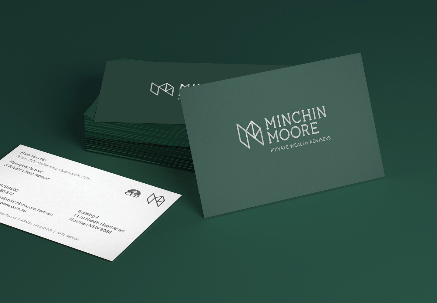
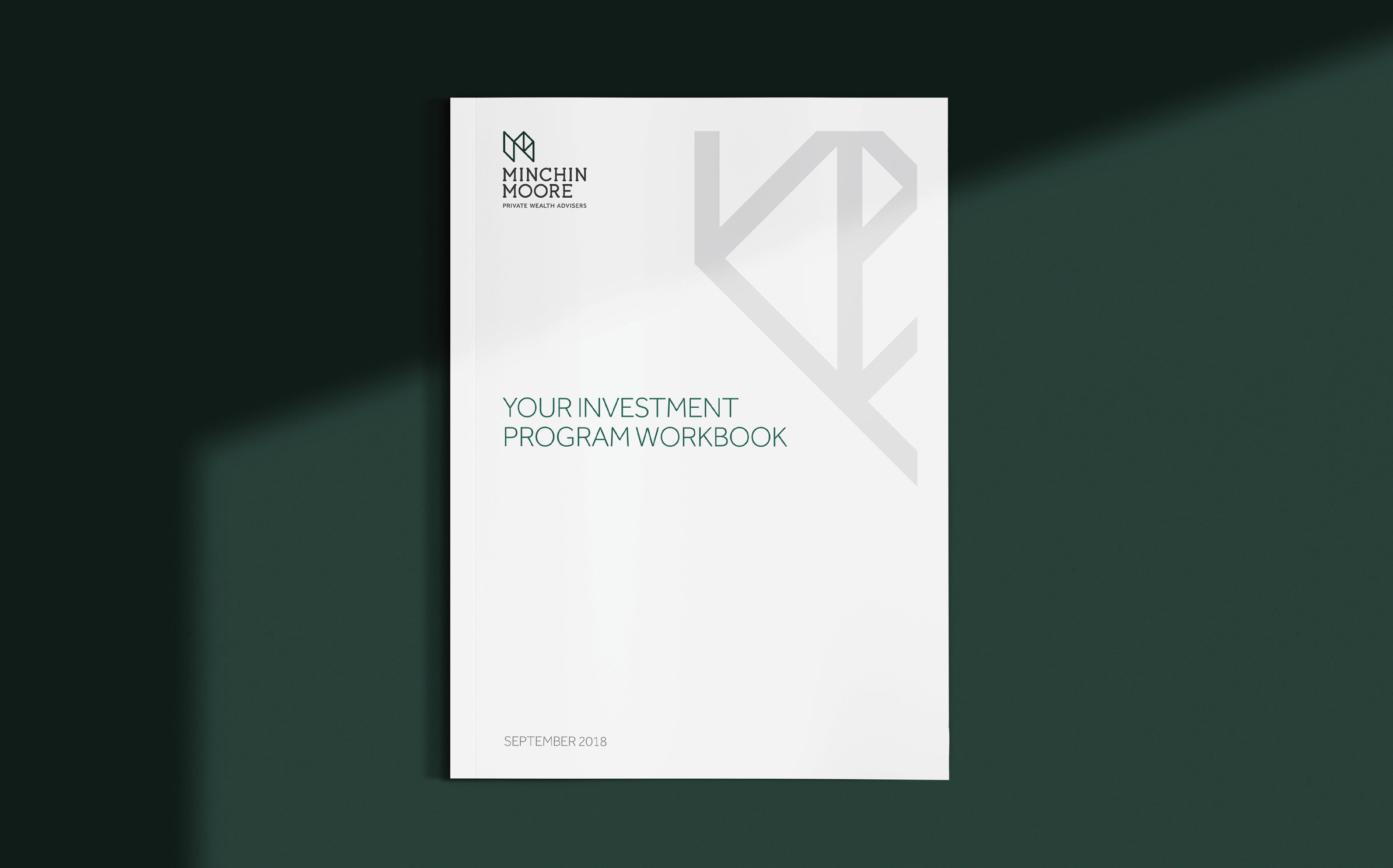
The incorporation of trees as a symbol of growth and security was part of the original brand, so for the revised brand, we created an elegant marque based around two interconnected Ms and inspired by the interconnected veins found on leaves.
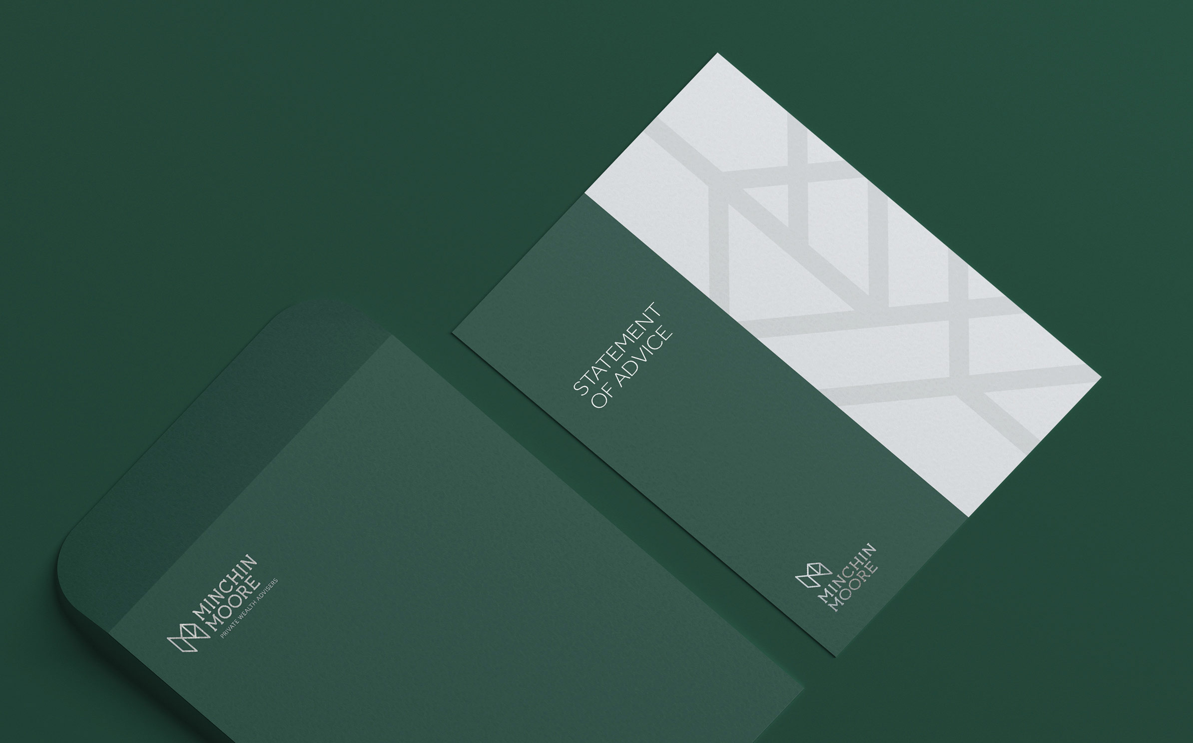
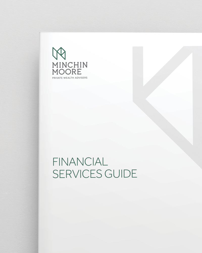
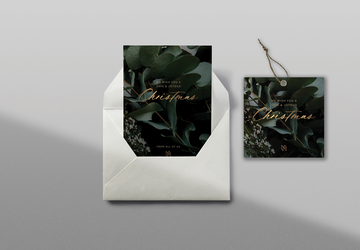
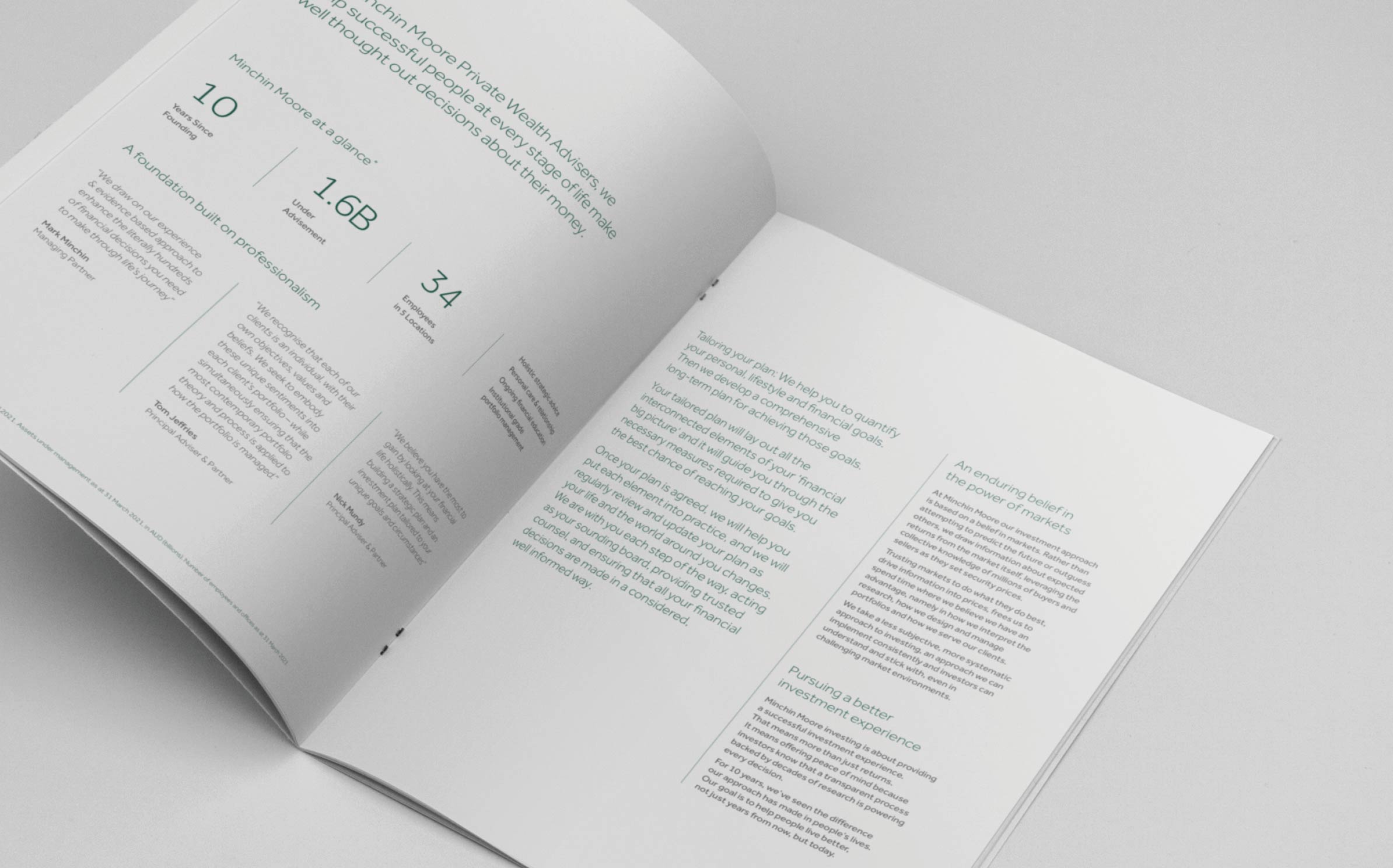
We also developed a secondary leaf marque and a repeating pattern that mimics a leaf vein structure. With an affluent client base in mind, we rolled out the new brand across a stationery set with a premium finish, client documentation, signage for rooms and a comprehensive website with animated explainer videos.
The direction of partner and staff photography is considered. Light and bright, with a casual corporate dress code and welcoming eye contact, ensuring advisers come across as honest, approachable and reliable. This reflects the professional, down to earth culture of the firm. The imagery filters trust and transparency through the website. It feels as though the team are with you as you read about their service.

