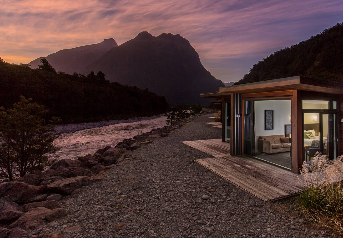
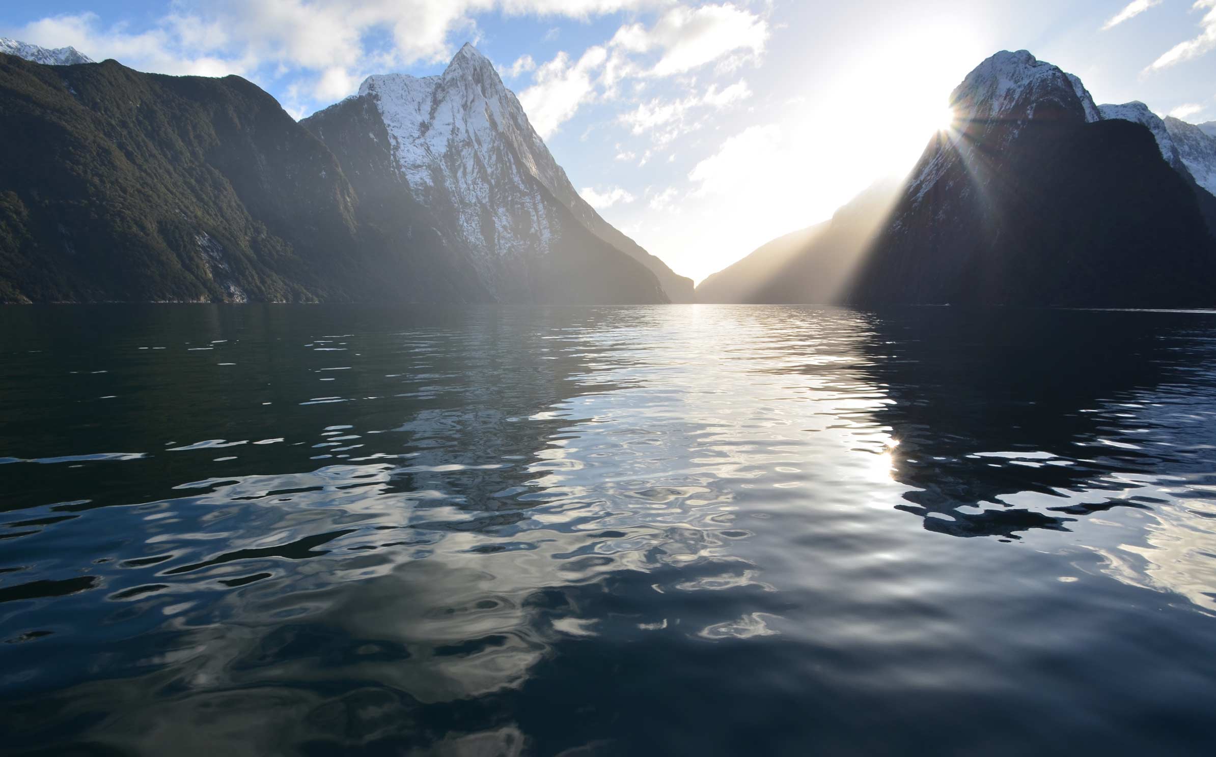
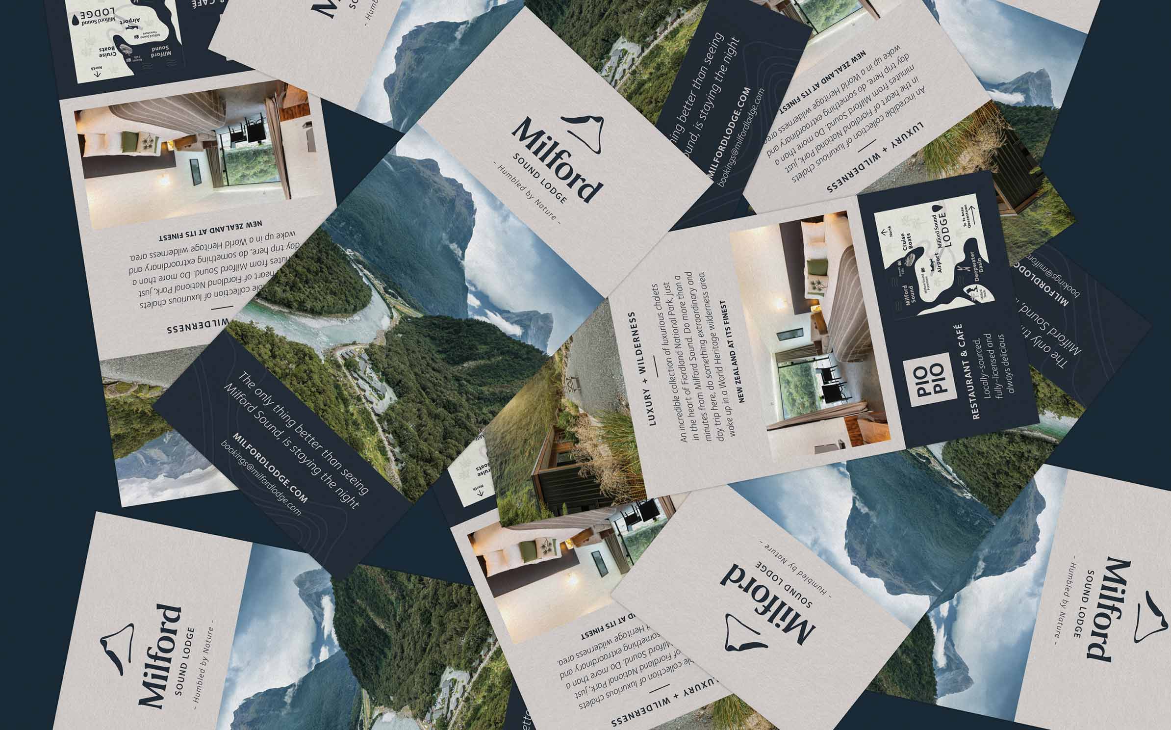
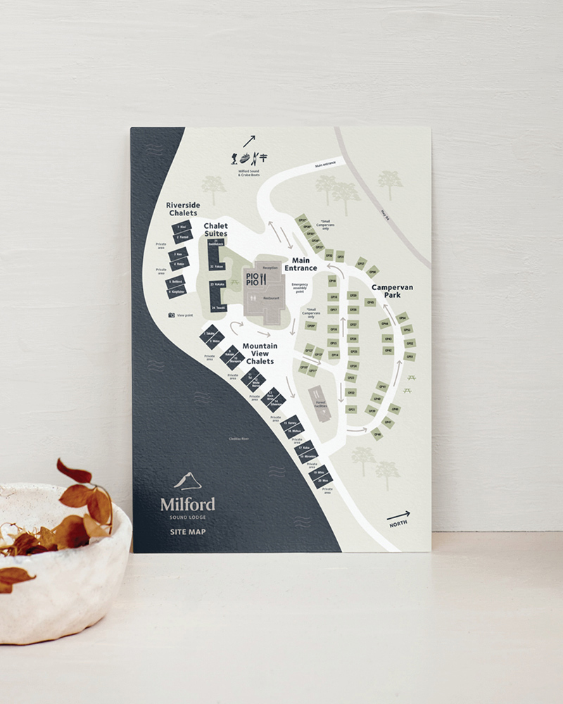
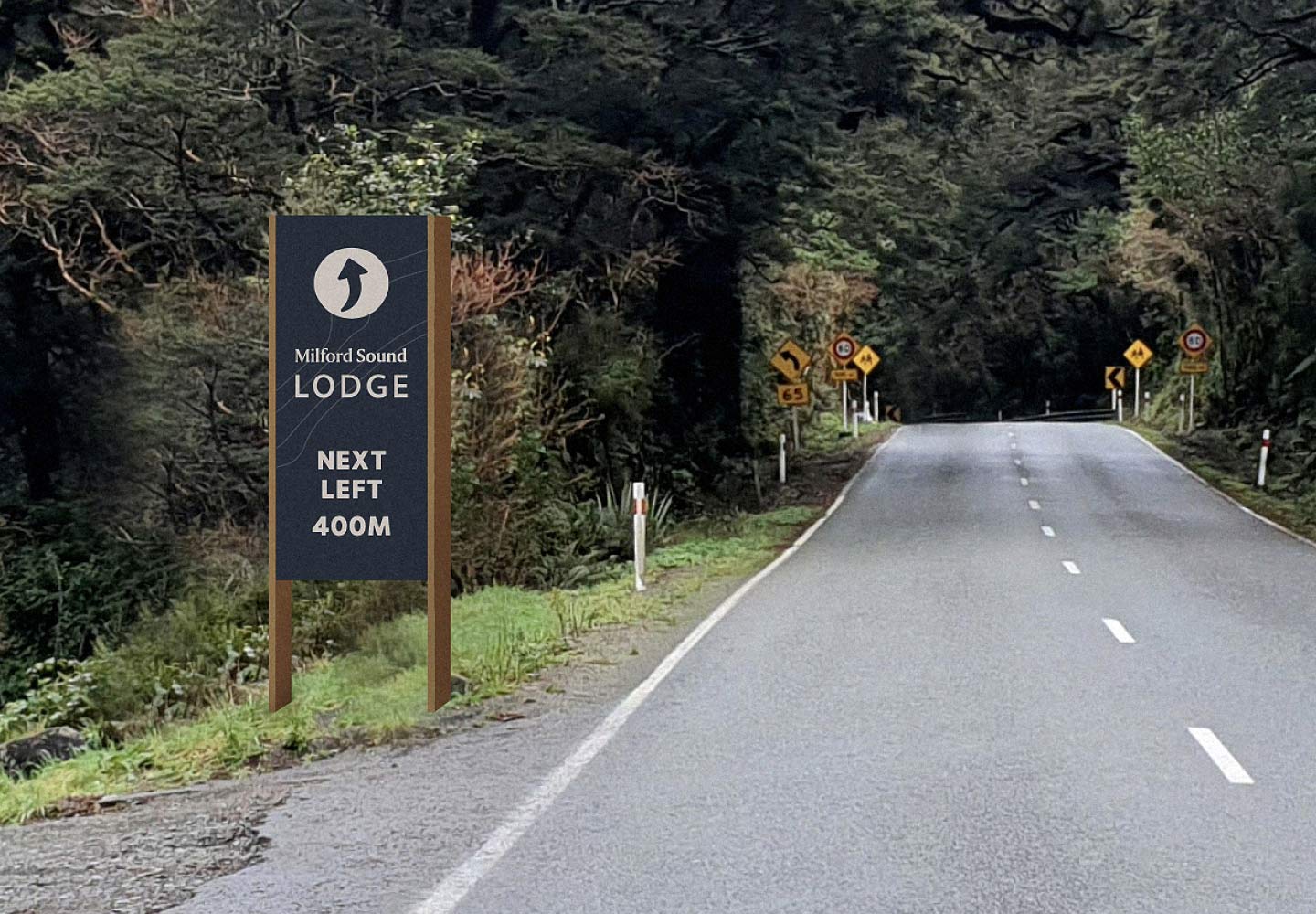
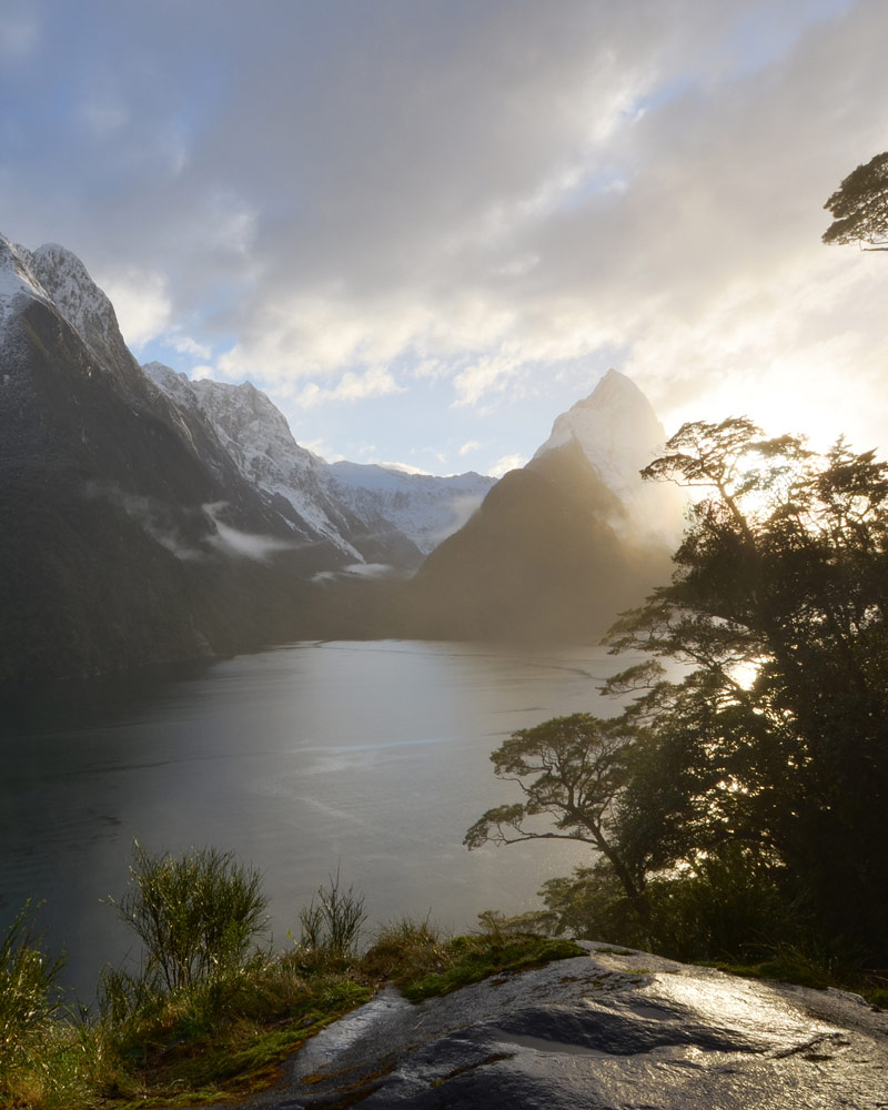
They describe Milford Sound as the eighth wonder of the world. Located on the south island of New Zealand, its majestic fjord, with incredible diving, kayaking and remarkable hiking tracks, are the pride of NZ. Milford Sound Lodge has a humble history, welcoming travellers with dormitory and camp-style accommodation and kitchen when they first opened. Since then, they have built off-grid resort style chalets and incorporated fine-dining. The Lodge is now a world-renowned eco destination.
As a part of elevating their offering, they engaged us to evolve the brand.
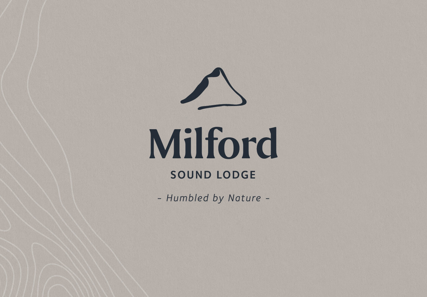
Key considerations as a part of the brief were to keep ‘Mitre Peak’ in the brand; ensure a warm and welcoming feeling; reflect a bucket list destination; make it feel premium but not luxury, and inclusive to all travellers; cater to nature lovers; be mindful of the Indigenous history and culture of the location.
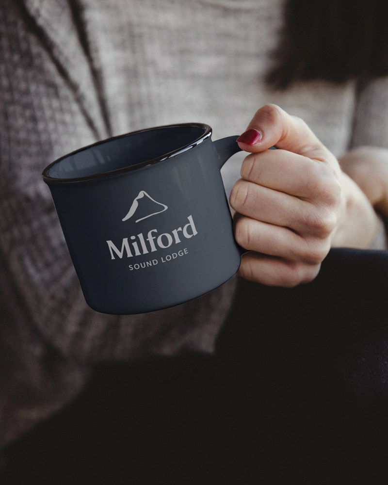
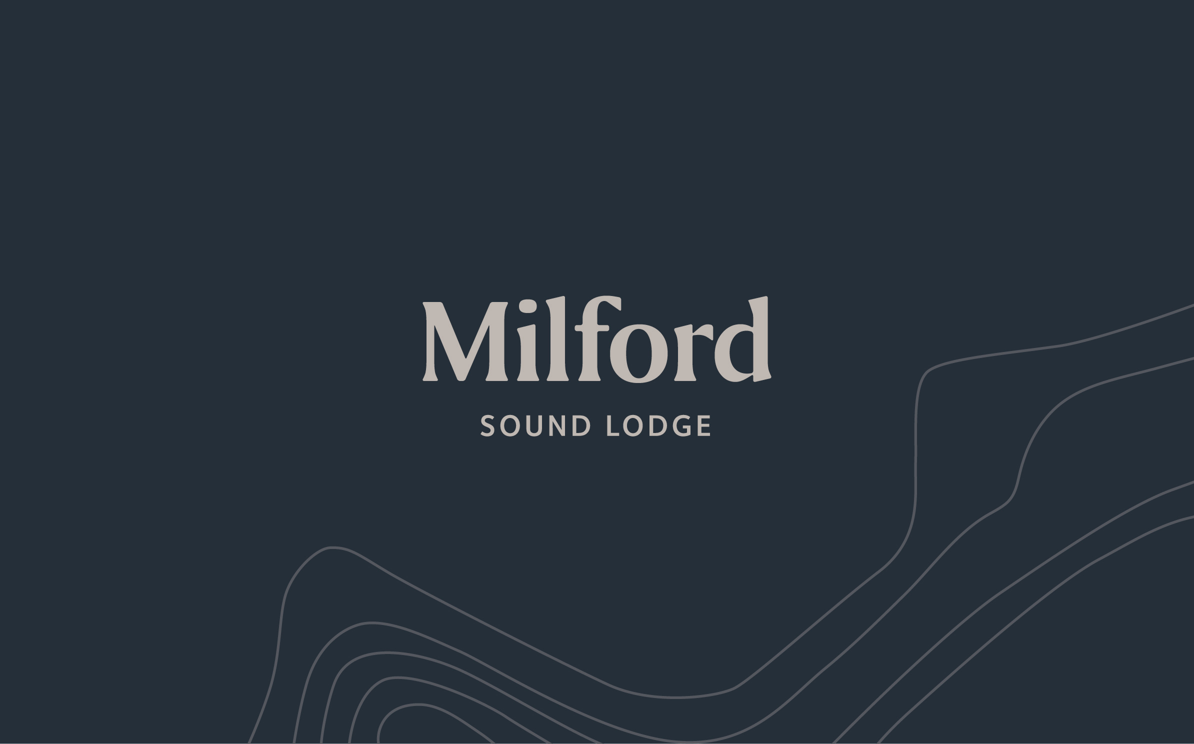
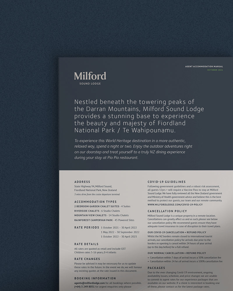
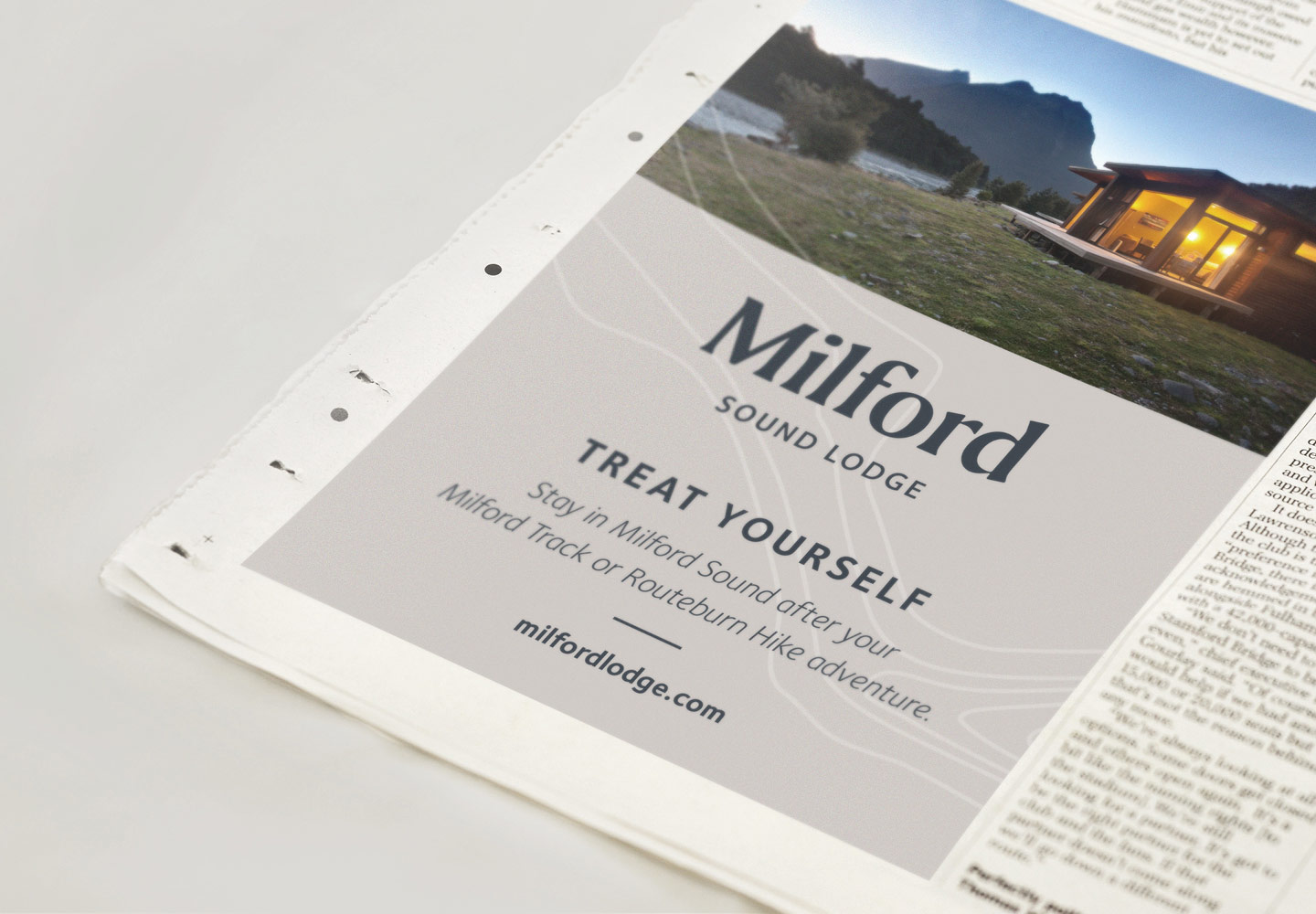
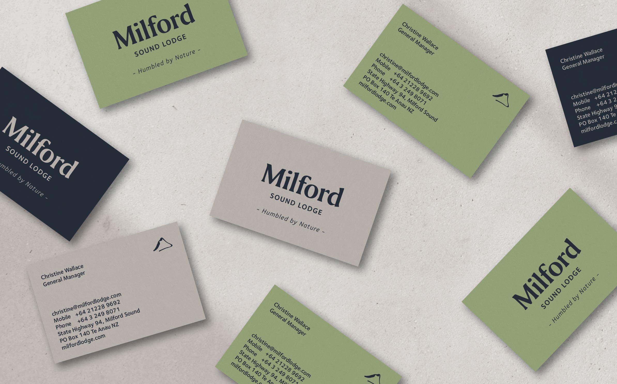
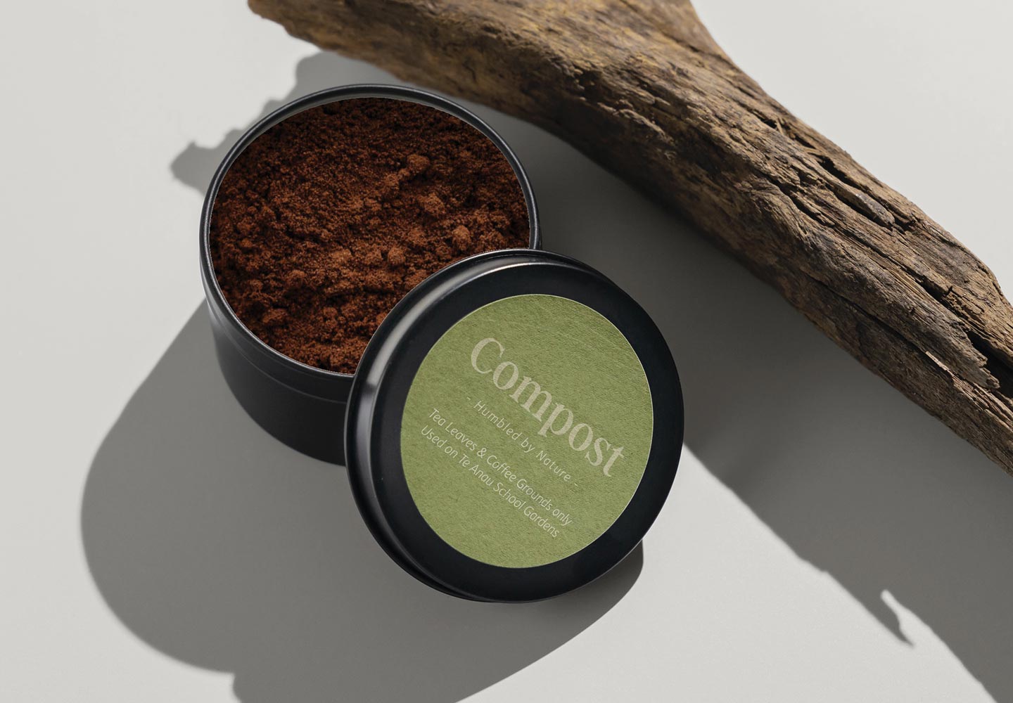
The wordmark blends Serif and Sans Serif typefaces, which compliment each other for a touch of understated sophistication. The colour palette includes colours found in nature. ‘Ironsand’ (deep blue), ‘Warm grey’, ‘Autumn Light’, ‘Jade’. Professional imagery of the Lodge and the area are key in communicating the rugged beauty of the place.
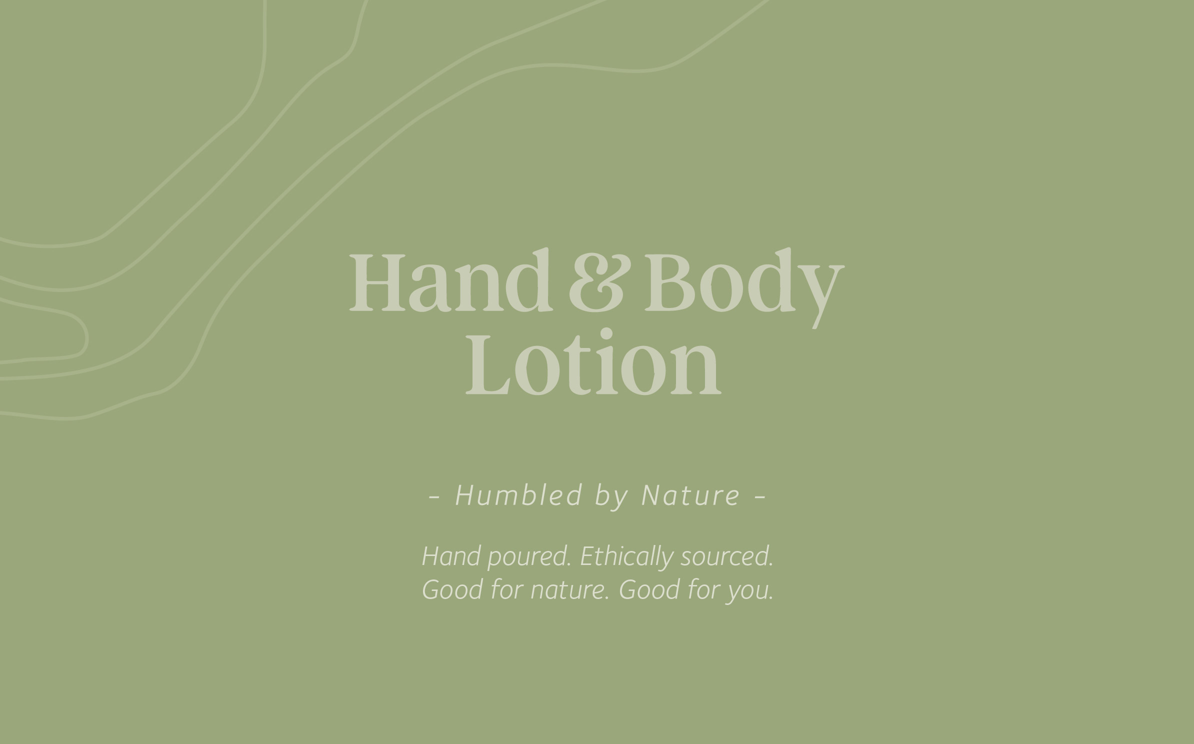
To add depth and versatility to the brand elements, we created a graphic that echoes the topographic contours of the land, to weave above and below imagery and colour.
We created the tagline ‘Humbled by nature’ as it refers to both the experience of guests staying in Milford, and also the business journey. You will be humbled by the wilderness, and the phrase also describes the culture of the lodge, which is unpretentious and welcoming ‘by nature’.

