

Gold Plumbing specialises in maintenance and emergency plumbing on the Gold Coast, Queensland. Aiming to target local customers, it was important that the name be one that people could find easily with a Google search, then remember, and also reflect the style of service. Naming the business Gold Plumbing therefore covered a few bases.
Gold Service, on the Gold Coast, after a history of sporting Gold.
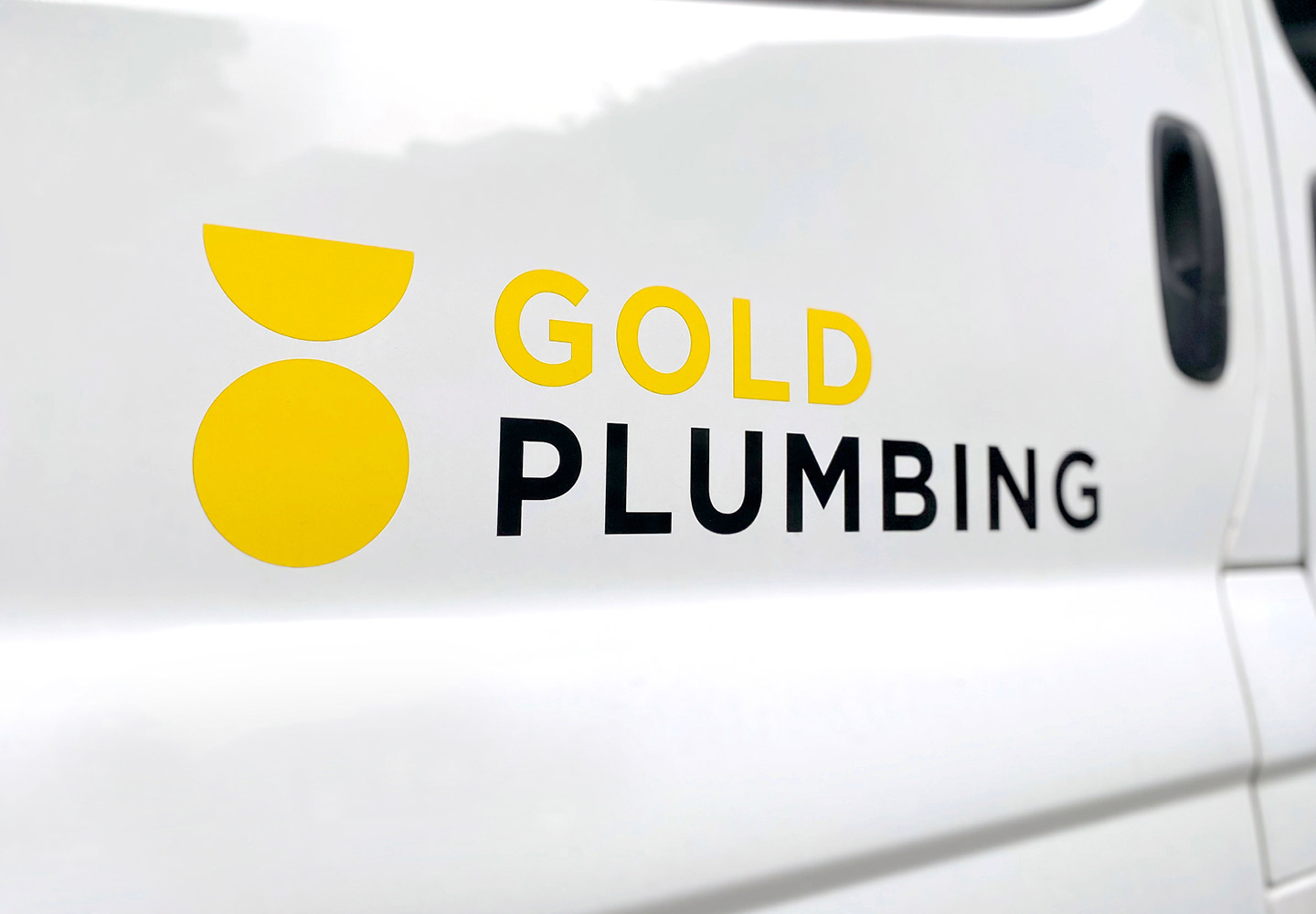
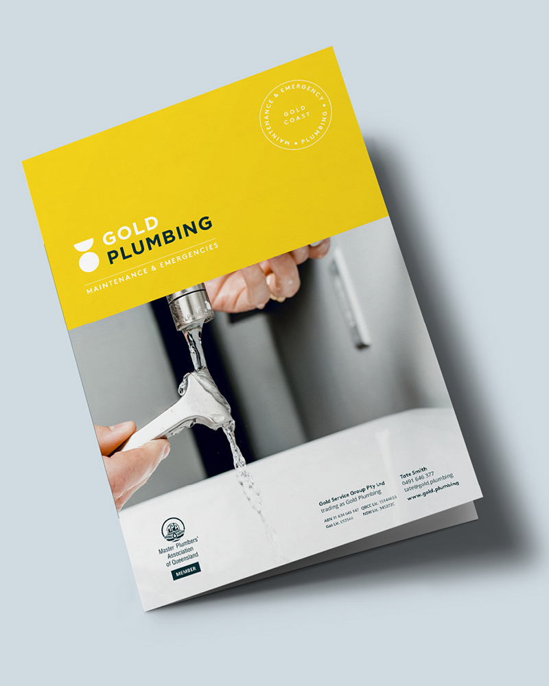
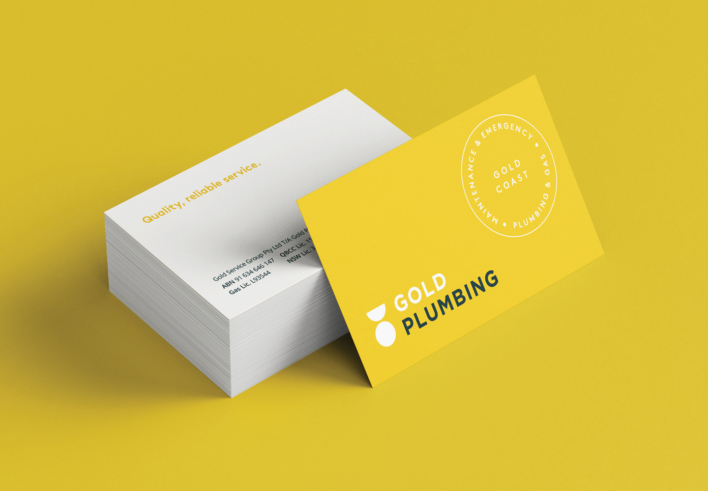
The brand needed to feel approachable and professional. Clients ranging from home owner occupiers to property managers and then also commercial operations. The brand icon is a simple shape combination to reflect a section of a pipe or fixture, and also a gold medal.
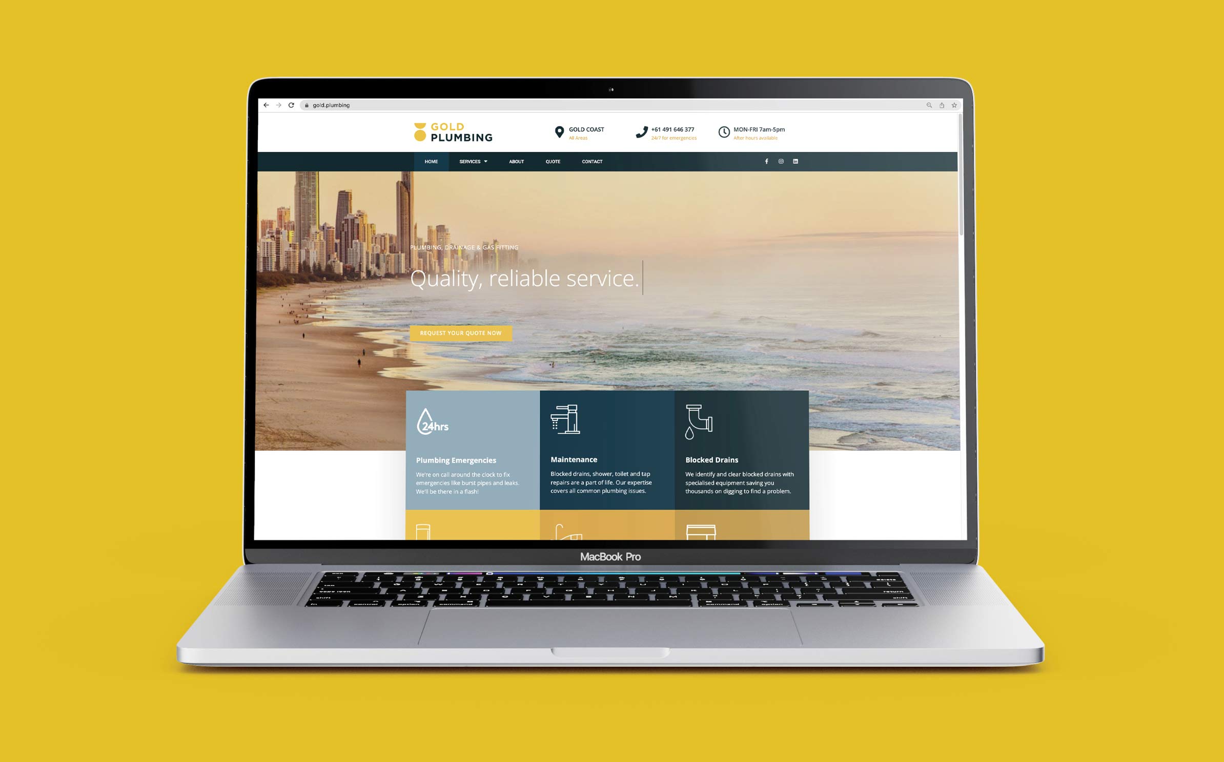
Colours are bold. Blues and yellow gold. A combination that presents professionally on vehicles and uniforms, but feels fresh. Blues represent water and the ocean, and gold as the name suggests, but also to stand out from competitors who are primarily blues and primary colours. Imagery includes taps, kitchens and bathrooms to help customers quickly understand the nature of the work. Images used are are well composed with a good balance of light though, to help illustrate that this is business has a focus on quality and professionalism.